The Plankton Project

Project Details
- Client
- Completion Date
- Category
- Case Study
The Plankton Project is a CIC dedicated to researching near-shore plankton off the Norfolk coast and making that research accessible to everyone. Since it was founded in 2023 it has completed over 100 plankton surveys, added more than 130 taxa to local records, and reached thousands of people through talks, workshops, and social media. The audience ranges from school children encountering plankton for the first time to working scientists contributing data to the NBN Atlas.
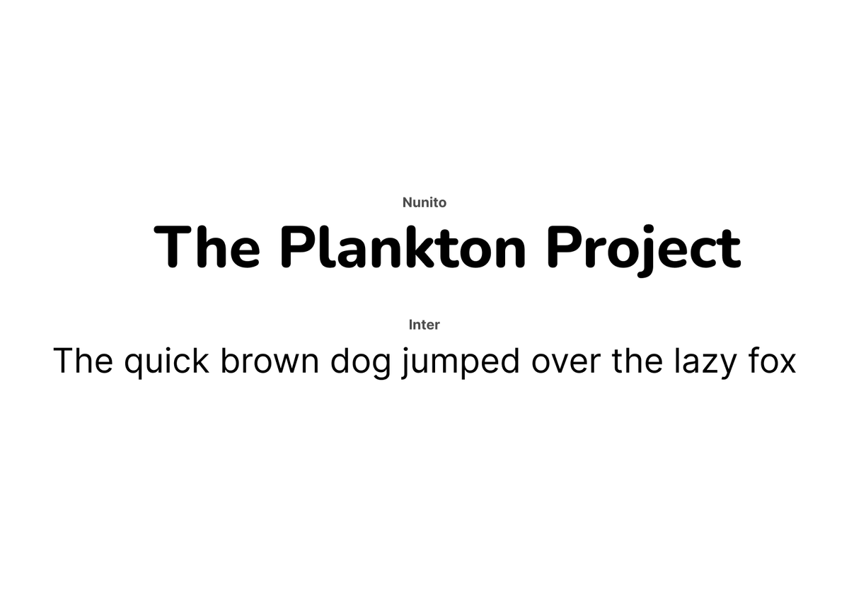
That audience range was the central brief for the brand. It needed to feel approachable and a little playful without losing scientific credibility, and it needed to reflect the genuine enthusiasm of the person behind it.
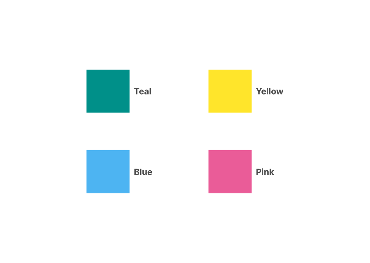
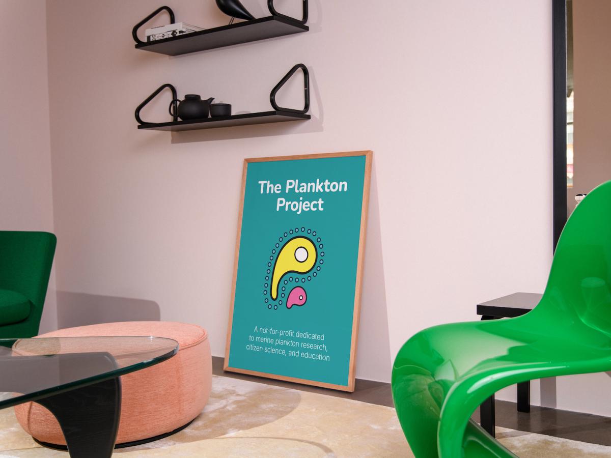
The logo is built around two stylised plankton characters, round-bodied and wide-eyed, designed to feel friendly rather than clinical. They also do a second job: together they form the two Ps in Plankton Project. The colour palette takes its cue from the client's favourite era, the eighties, running through teal, blue, pink, and yellow. It's bright and deliberate, and it works because it matches the project's energy rather than defaulting to the muted greens and blues you'd expect from a marine science organisation.